Many start the process by using some version of a discounted cash flow (DCF) model. I’ve read some great reports from top crypto funds that do a bottoms-up analysis on how much revenue a specific crypto asset may generate based on a model and some assumptions. For example, here is great analysis and valuation model on EOS. I think that’s a good approach when markets have matured and are in the Synergy or Maturity Phases of Carlota Perez’s model for technological revolution (see below). In the Frenzy Phase, however, using the hard data to calculate relative value is more beneficial.
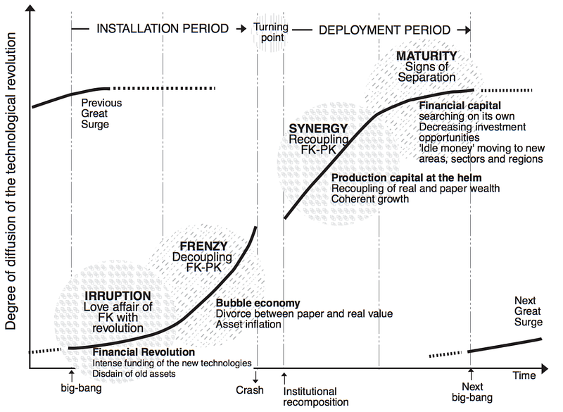
From “Technological Revolutions and Financial Capital” by Perez
I believe we have just completed the Irruption Phase and started the Frenzy Phase of a completely new long-wave economic cycle which I call the Age of Autonomy. You can read more about that in my article, Crypto’s Role in the Age of Autonomy. In the Frenzy Phase, there is a de-coupling of price and value. That’s why they call this age a Gilded Age, distinct from a Golden Age.
Many of us who were around during the Internet boom of the nineties remember trying to come up with a new valuation model for New Economy businesses. In many cases, there were no profits yet, and in some cases, there wasn’t revenue. If you wanted to try and value a dot-com company at that time, a discounted cash flow model would not have helped you. At that point, you could have either not invested in the new technology or you could have come up with a new framework for valuing those assets. We started to think about eyeballs and page-views.
In the early phase of the cycle, most assets don’t have revenue or profit yet (or not many do). Since most crypto assets are networks, it makes sense for fundamental analysis to focus on usage and utility (see below). Even if these crypto assets do not yet have cash flow, they still have value in the form of their potential.
This framework uses relative value to make directional decisions based on following the major reserve crypto asset which is bitcoin. Investors typically have to buy bitcoin before they can invest in any other crypto asset. So, tracking usage of the reserve asset will give us information about the crypto markets as a whole. Since these crypto assets are networks, our model will focus on how we value networks. We do have some experience with that.
Network Effects & Metcalfe’s Law
Most crypto assets have network effects. Network effect is a property of an asset or collection whereby it becomes more valuable to the existing users as more people are added. Metcalfe’s Law states that the value of the network is proportional to the square of the number of connected users. This basic version has been disproved though, and is now hypothesized that network value is more likely an S-curve than just a n2 quadratic. Since most crypto assets are networks and have network effects, users and utility become important considerations when thinking about how to value the asset. To that end, most of the metrics in this fundamental analysis framework focus on users, usage and utility for indicators and then price-to-utility for the ratios.
9 Metrics — 5 Indicators & 4 Ratios
Here are the 2 categories of 5 indicators — directional indicators and current usage indicators. Then we also have 2 categories for the 4 ratios — current valuation ratios and long-term valuation ratios.
Directional Indicators
These indicators show continual direction of 2 major short-term indicators. These are the most time-sensitive and transitory of the 5 indicators.
- NVT Directional Indicator — this shows what direction the valuation ratio is headed, either heading towards adding relative value or losing relative value in the NVT Ratio.
- Correlation Directional Indicator — this shows whether the crypto assets are getting more or less correlated. If crypto assets are getting more correlated that generally means a bearish trend while assets getting less correlated means a more bullish trend.
Current Usage Indicators
These indicators measure direct network usage and utility. These indicators show that current network utility in the form of: 1) number of daily unique users; 2) daily transaction value (in USD); 3) mining fees which are the revenues the network is generating. If the crypto network is being used by more people per day and is being used to move more value, then its intrinsic value is increasing.
- Unique Addresses (Daily) — this counts the unique addresses used in transactions per day. This data is being used as a relative indicator. If the unique addresses trend is increasing, that’s bullish for the crypto markets.
- Transaction Value (Daily) — this counts the estimated U.S. dollar transaction value daily. This data is being used as a relative indicator. If the amount is increasing, that’s bullish for the crypto markets.
- Mining Cost (Daily) — this averages the fee that the miners are generating for processing transactions on the blockchain. This is distinct from the block rewards miners are paid for generating the next block of transactions on the blockchain. If the fees are moderate, that’s bullish for the crypto markets. If the fees are really low, like below 20 cents, or really high, like above $20, that’s a red flag and is indicating something is wrong and requires further investigation.
Current Valuation Ratios
These ratios track current relative network value. The NVT Ratio is similar to a P/E Ratio in the equities markets and is one of the core valuation metrics in crypto analysis. It measures network value to transactions (NVT). The MVRV Ratio is market value by realized value (MVRV) and is a similar yet more complex ratio to the NVT Ratio. Realized value tracks the trade price at which the last trade was executed.
- NVT Ratio — Undervalued is <55 & Overvalued is >75
- MVRV Ratio — Undervalued is <1.2 and Overvalued is >3.2
Long-term Valuation Ratios
These ratios are tracking long-term relative network value. The Mayer Multiple calculates price against the 200-day moving average. This gives a ratio relative to time and past trading prices. The P/BE Ratio shows the value ratio of price to miner’s break-even cost. This gives a ratio of price relative to production cost.
- Mayer Multiple — Bullish is <1.0 and Bearish is >2.4
- Mining P/BE Ratio — Bullish is <1.2 and Bearish is >3.2
Interpretation
It’s important to learn how to use these indicators and ratios to inform your decision-making and investment plan. Below, we’ll outline a few different patterns to give you a sense of how to use this metric data and how to interpret it.
A Network in a Downtrend with Early Stage Indicator of a Possible Trend-Reversal

Note: Dashboard showing metrics as of July 28, 2019
The dashboard above shows a market that has already crashed and taken a lot of the downwards pricing, but is still overvalued, is still in a bear market but may be reversing due to increased usage. At the end of a crypto winter, you will finally start to see deep value in the long-term ratios. It may be like that for a while until valuation ratios are finally signaling value through price decline or usage increase. You’ll know when to get into the market when the Current Valuation Ratios catch up with the Long-term Valuation Ratios.
A Network Showing an Uptrend in Network Utility & Deep Value

Note: Dashboard showing metrics as of February 10, 2019
The dashboard above shows a market that has already crashed and taken a lot of the downwards pricing, but is still overvalued, is still in a bear market but may be reversing due to increased usage. At the end of a crypto winter, you will finally start to see deep value in the long-term ratios. It may be like that for a while until valuation ratios are finally signaling value through price decline or usage increase. You’ll know when to get into the market when the Current Valuation Ratios catch up with the Long-term Valuation Ratios.
A Network showing an Uptrend in Network Utility & Deep Value

Note: Dashboard showing metrics as of March 11, 2019
The dashboard above shows a market that has bottomed, is showing it’s undervalued and network utility is showing increasing usage in the network. This is what the dashboard looks like when a crypto winter has bottomed and is setting up for an uptrend reversal. The price has gone down so much that all the ratios are showing relative value. As well, the Current Indicators are showing improving usage and utility. Finally, the Directional Indicators are showing positive activity. This is what it looks like to see a trend reversal after a crypto winter.
A Network OvervalueD with Price Rising Faster Than Usage

Note: Dashboard with metrics showing June 26, 2019
Above shows a market that’s growing utility, but price may have run too far, too fast and needs to consolidate. The Current Indicators are showing usage and utility are going up and in a positive uptrend. However, the Current Valuation Ratios are showing that price is going up faster than the increased usage. You’ll also notice that the NVT Directional is showing you that as well.
Bitcoin Chart YTD for 2019 for Comparison

If you look at Bitcoin trading history, you can see the fundamentals would have helped your trading. Fundamental analysis of the Bitcoin network will show when there’s deep value (typically from a major correction during a long bear market), when there’s an increase in usage or when price has risen too far, too fast. Checking the dates of the network metrics on the price chart of bitcoin illustrates the point.
Conclusion
At Tradecraft Capital, this Tradecraft Fundamental Analysis (TFA) framework is the basis of our fundamental analysis. We take a multi-layered approach to our fundamental analysis. This is the first layer. These metrics are pulled from the Bitcoin network solely and are used to make directional decisions that inform an investment plan.
In 2019, crypto assets have become less correlated, usage in the network has increased and value is present which means an end of the crypto winter. A new bull market cycle has begun. That’s been validated with the price-action of bitcoin moving up strongly through several key levels of resistance and the strong performance in Q2. As we march through the cycle, it will be important to use the directional indicators as the most time-sensitive metrics, the current usage indicators to warn when usage and utility is decreasing and the valuation ratios to warn when price may be overvalued. Armed with these, fundamental analysis should give the investor more data points from which to make an informed investment decision.
Disclaimer: The above references an opinion and is for information purposes only. It is not intended to be investment advice. Please do your own homework.
#crypto #cryptocurrency #bitcoin #investing #howto #blockchain #cryptoinvest #cryptoinvesting #cryptotwitter #valuation #cryptovaluation #fundamentalanalysis #tradecraft